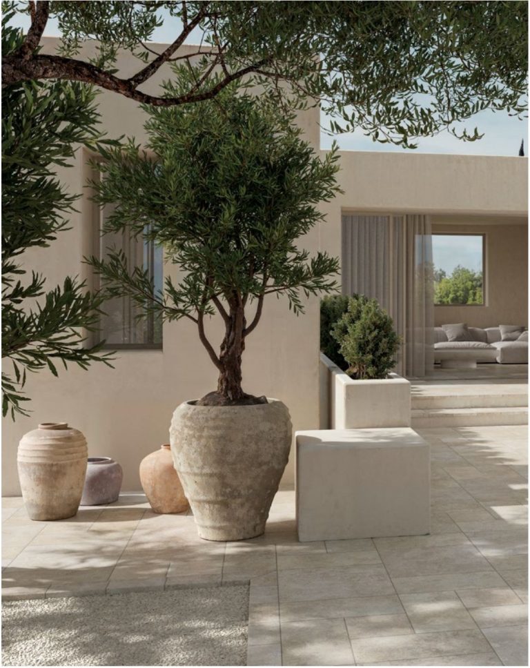
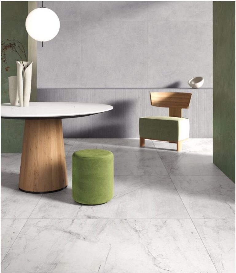
Indoors, stone effect works in a matt natural finish and slip class R9 or R10: the textured R11 that is essential outside is rough under bare feet inside and traps dirt in its micro-relief. Then you decide room by room: hallway and kitchen in mid tones that forgive, living room in large format with grout matched to the tile, bathroom R10. On underfloor heating it is the best flooring there is, at 9 mm thick.
Stone effect is the largest family in our catalogue: 383 references, ahead of concrete effect at 268. It is also the one people buy worst, because most of what you find online talks about stone outdoors: terraces, pool surrounds, driveways. Inside the house the rules change, and they change on three very concrete things — the finish, the tone and the format. This is not about which stone to imitate (we have covered that elsewhere): it is about making it work in the rooms you actually live in.
The finish comes before the colour: why R11 is a mistake at home
This is mistake number one for anyone ordering stone effect online. You read “R11 anti-slip” and it looks like a bonus: more safety, more grip, same price. In a living room it is a straight downgrade.
That roughness, outside, is what keeps you upright on wet stone. Inside it is a surface that scratches bare feet, chews through socks and holds dirt in the micro-relief: the mop glides over it without really cleaning, and shifting grease needs an alkaline detergent and some elbow grease. In a dry room, in house slippers, that extra grip does nothing for anyone.
The rule of thumb for indoor rooms is simple:
- R9 — dry zones: bedrooms, living room, corridors, study. Smooth natural surface, the easiest to clean.
- R10 — where water arrives: bathroom, kitchen, utility room, hallway. A hint of grip without penalising cleaning. It is the most common standard in our catalogue: 432 references out of 842.
- R11 — outside, full stop: terrace, pool surround, ramp, external steps. Indoors it only belongs in a cellar you hose down or a garage (for garages the reasoning is different again — thicknesses and loads).
If the letters still feel abstract, we have gone through them room by room in the guide to R9, R10 and R11. Every product page states the class, and the standard it comes from.
Room by room: what actually changes
“Stone effect indoors” is not one decision: it is four or five different ones, and they change with what happens in that room. This table is the summary we give customers over the phone.
| Room | R class | Tone that works | Format | The critical point |
|---|---|---|---|---|
| Living room | R9 | Free choice: this is where you set the style of the house | 61×122.2 or 90×90 cm | Grout matched to the tile: over a large floor the grid reads louder than the stone |
| Kitchen | R10 | Mid tones (greige, warm grey): very pale shows grease and crumbs | 61×61 or 61×122.2 cm | In front of the hob a matt surface holds grease more than a lappato: degreaser, not just water |
| Hallway | R10 | Mid-dark or textured: forgives grit, rain and footprints | 61×61 cm | The first zone to wear: here a textured stone outperforms a smooth one |
| Bathroom | R10 | Light or warm beige, so you don’t close in a small room | 61×61 cm on the floor, large format on the walls | Total stone look, floor plus walls: beautiful in photos, claustrophobic in 4 m² |
| Corridors and internal stairs | R9-R10 | Same as the living room, for continuity | Same as the living room | Risers need cut pieces: put them in the wastage allowance |
| Cellar, utility room, garage-adjacent store | R10-R11 | Dark and textured | 61×61 cm | The only case where R11 indoors makes sense: it gets washed with plenty of water |
One criterion holds the whole table together: water decides the finish, dirt decides the tone, surface area decides the format. The colour you like comes afterwards — and there you have more freedom than you think.
Light, grey or beige: your daylight decides
You only go back on this decision with a demolition hammer, so it is worth two minutes of thought. Don’t judge the sample in a showroom or on a screen: look at it in your own room, at 10 in the morning and at 8 in the evening.
- North-facing rooms, cool light: a grey stone turns bluish and flattens the space. Go for warm limestones — ivory, sand, almond (in our catalogue, for instance, the lighter tones of Limestone or Saint-Michel). This matters more the further north you live: in the Netherlands or Belgium a mid grey in November looks a shade colder than it did on the sample.
- South-facing rooms, plenty of light: grey holds up beautifully here and stays elegant, while very pale tiles can glare and flatten the pattern. An urban grey like Tribeca or the textured Ceppo di Gré is in its element.
- Open plan with dual aspect: mid tone, greige. It is the compromise that doesn’t let you down in either half of the room.
Something customers don’t enjoy hearing, and we say anyway: there is no such thing as a neutral beige. Every beige has a pink, yellow or green undertone that jumps out next to the oak of your doors and the white of your walls. That is exactly why samples cost 5 € and we refund them on your first order: those 5 € are worth more than any render.
If you still have to decide which stone to imitate — ceppo di gré, travertine, slate, limestone, Lecce stone — the comparison between the families is all in the dedicated guide: stone effect porcelain: which one to choose. Here we stay on making it live well indoors.
If you have underfloor heating, stone is the right call
Briefly, because we have already done the physics elsewhere: porcelain conducts heat around eight times better than wood, so the system runs at a lower flow temperature and uses less energy. That is worth real money in the countries where underfloor heating comes as standard with a heat pump — most new builds and extensions in the Netherlands, Belgium and Austria. Stone effect behaves like any other porcelain here: 9 mm thick and no temperature limit. The 20 mm stays outside, on the terrace. Laying rules, conductivity compared and the running-cost maths are in the guide to porcelain and underfloor heating.
Formats and grout: indoors, stone is laid wide and matched
Real stone comes in small, irregular slabs, because the bigger it gets the heavier and more fragile it is. Porcelain has no such constraint, and indoors you should exploit that.
- Large format even in small rooms. Fewer joints means fewer lines cutting up the floor, and a room that reads larger. A 61×122.2 cm (roughly 600×1200 mm) in a 6 m² bathroom works: how to do it is in the guide to large formats in small spaces.
- 2 mm joint on rectified tiles. Never go below 2 mm, not even with perfect edges: the tile has to be able to move. And it is always a joint — never butt-jointed.
- Grout matched, not contrasting. On stone effect, dark grout on a light tile turns the floor into a chessboard and kills the illusion of material. How to pick the right grey (and why pure white is almost always wrong) is in grout colour.
- One-third offset, never half on long formats: with a 50% offset the slight central bow of large slabs is noticeable underfoot at the edge.
The practical sum, so you know where you stand: a 28 m² living room in 61×122.2 cm at 34.00 €/m² VAT included. With the 10% wastage of straight laying that is 30.8 m², so 1,047.20 € of material, pallet delivery separate. The calculator on the product page turns m² into whole boxes: you always order full boxes, and it pays to order everything at once, because different production batches can vary slightly in shade and calibre. Two notes on the price: the catalogue figure is the same in every language version of the site and always shown VAT included, and the exact amount for a delivery outside Italy is confirmed at checkout; installation is a separate budget line and rates vary widely from one country to the next.
Pairings: wood, off-white, green — and the “total stone” to avoid
Stone is a background, not a lead actor. Three pairings that almost always work indoors:
- Grey stone plus warm wood. Natural oak or walnut on the furniture takes the coldness out of the grey. It is the most requested combination in living rooms, and it ages better than any trend.
- Beige stone plus off-white plus sage green. The Mediterranean register, made for bright houses and kitchens with matt fronts.
- Pale stone plus matt black. Black handles, shower frames and window profiles on a limestone background: contemporary without turning glacial.
And the mistake not to make: stone on the floor, stone on the walls, stone on the worktop. Three textured surfaces in the same room cancel each other out and the house ends up looking like a hotel spa. Pick one surface to lead and leave the others smooth.
Where to start
- Fix the finish and R class first for each room using the table above: it is the filter that halves your options before you even look at colours.
- Narrow it down to two or three references in the stone effect tiles category, where each one shows format, R class and price per m² VAT included.
- Order samples and look at them at home, by day and by night, laid next to the doors and the sofa that are staying.
If you are doing several rooms at once and want the tones and formats to agree with each other, write to us before ordering: we will look at the plan for you, free of charge, and tell you where it is worth switching reference from one zone to the next.