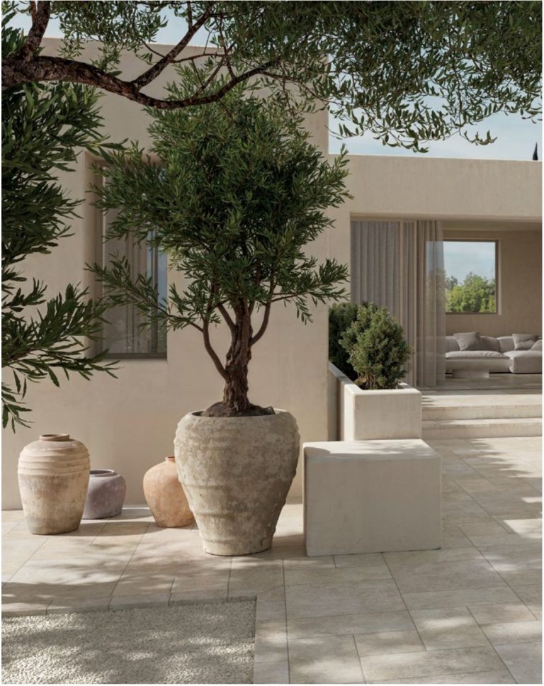
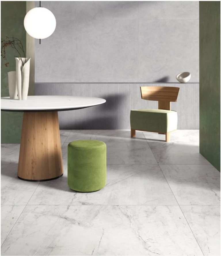
Basic rule: grout in the same tone as the tile, half a shade darker, for a uniform floor that makes the space feel bigger; contrasting grout only if you want to spell out the geometric grid. On wood-effect go for the colour of the plank (never white), on marble-effect a shade just darker than the background, and outdoors and in the shower go for mid tones that forgive dirt.
It always happens the same way: months spent choosing the tile, then the tiler asks “and what colour grout?” and the decision gets made in five minutes, standing over the colour chart on site. A shame, because that choice changes the look of the floor as much as the tile itself — and, unlike a piece of furniture, it never moves again. Let’s look at how to decide it properly, effect by effect.
Why grout changes everything (and why you can’t get rid of it)
First, a clarification: the “grout-free” floor doesn’t exist. Even with rectified tiles the minimum joint is 2 mm, as we explained in the guide to rectified tiles; those catalogue photos where the slabs look fused together are, precisely, photos. The real choice isn’t “grout, yes or no”, but how much the grout should show.
The mechanism is perceptual: the eye reads the floor as a single surface until it finds lines that interrupt it. Grout in tone = continuous surface, bigger room. Contrasting grout = grid in the foreground, the tile format takes centre stage. Neither is “wrong”: they’re two different design choices.
And remember that colour and width work together: on a 2 mm joint even a wrong colour barely shows, on a 5 mm joint any colour becomes a graphic element. The wider the joint, the more the colour choice weighs — which is why outdoors, where joints are generous, the issue can’t be ignored.
In tone or contrasting: the two strategies compared
One cross-cutting tip: in tone doesn’t mean identical. Grout in exactly the same colour as the tile is impossible to get right (grout always dries a different shade) and when it’s off, it’s off in a visible way. Half a shade darker than the tile background: it blends better and forgives dirt.
Effect by effect: the table of right choices
| Tile | Recommended grout | To avoid |
|---|---|---|
| Wood effect | In the colour of the plank, half a shade darker | White or light grey: turns planks into tiles |
| Stone effect | In tone with the background, mineral shade | Strong contrasts that break the natural look |
| Concrete effect | Grey in the tone of the surface | Warm beiges that clash with the urban character |
| Marble effect | Just darker than the background, never the veining | Dark grid grout on light marbles |
| Solid colours / small formats | Here contrast is legitimate: it’s a graphic design | No prohibition, but keep it consistent with the style |
The trickiest case is also the most searched for: wood-effect porcelain stoneware. Real parquet has no light grid joints, so plank-coloured grout is the final move that completes the illusion — together with a staggered layout or herringbone. With white grout, the same floor goes back to announcing itself as tile: we showed this too in the pairings in the guide to wood-effect porcelain stoneware in the bathroom.
Critical spaces: shower, kitchen, outdoors
- Shower and bathroom. A shower floor with white cement grout is a mistake that shows up after six months: limescale and soaps turn it grey. Go for a mid tone, and for the shower area consider epoxy grout (below).
- Kitchen. On the floor the half-a-shade-darker rule applies; on the splashback the grout works hard and a mid tone remains the wisest choice.
- Outdoors. Soil, pollen and rain decide the colour of light grout for you, usually within a year. Mid grey or anthracite, no second thoughts.
If after all the rules you’re still undecided, there’s an answer that rarely gets it wrong: mid grey, the tone colour charts call cement, manhattan grey or similar. It works for three concrete reasons: it sits well next to almost all cool tones and many warm ones, it doesn’t yellow to the eye the way dirty white does, and it hides everyday dust better than any other colour — very light grout shows dark dirt, very dark grout shows limescale and light dust: mid grey shows almost nothing.
When not to play the wildcard: on warm wood effect (oak, walnut), where grey chills the planks and you need a taupe or a brown; and on very dark floors, where a mid grey effectively becomes contrasting grout without you having decided it. In those cases, go back to the table.
Cement or epoxy: the material before the colour
The choice of material also affects the colour over time: cement grout is porous and darkens in patches in wet areas; epoxy keeps its first-day colour practically forever, costs more and needs a tiler who knows how to work it (and who cleans off the residue straight away: once hardened it’s a serious problem). In the shower and on the kitchen worktop epoxy pays for itself; in the rest of the home a quality cement grout does the job.
As for the practical colour choice: grout manufacturers’ charts now count 40-50 standard shades, and the same shades almost always exist in both versions. This means you can decide the material first based on the space and then the colour based on the tile, with no compromise between the two.
The worked example: how much grout to buy
Consumption is estimated with a simple formula: kg/m² = (L + w) ÷ (L × w) × tile thickness × joint width × 1.55 (measurements in millimetres, 1.55 is the typical density of the grout).
Floor in 60×60, 10 mm thick, 3 mm joint: (600 + 600) ÷ (600 × 600) × 10 × 3 × 1.55 = 0.16 kg/m². For a 20 m² living room: 20 × 0.16 = 3.2 kg → a 5 kg bag is more than enough. Note how the narrow joint of rectified tiles (2 mm) would bring consumption down to about 0.10 kg/m²: one more reason why the tile calculation and the grout calculation should be done together, like the calculation of boxes and wastage.
The next step
- Decide the strategy before the job starts: in tone for continuity, contrast only if it’s a deliberate style choice. Five minutes today, not standing over the tiler.
- Test the colour on the real sample. Wet grout is darker than it will dry: hold the colour chart against the sample of your tile in your home’s light. Samples arrive in 24-48h and we refund them on your first order.
- Put the colour in writing in the laying quote, with the chart code: “grey” for you and “grey” for the tiler are rarely the same grey.